Showing posts with label Logos. Show all posts

Thursday, October 06, 2011

0 comments
Hair Zone

Hair Zone is a Hair Salon that needed a tee design with the purpose that their
employees will use as a uniform. However, the salon did not have a logo.

Here is a logo I did for their salon that was both "feminine" and "pink" as they had
asked.
0 comments
MFSP - Military Family Support Program
This program is being in partnership with USC,
The VA Bulding and the YMCA of South Bay Torrance.


The Military Families Support Program logo (MFSP) was created
with the words Enrichment, Military, and Family in mind.
As I explored different designs for this program I considered
how to portray enrichment a feeling of wellness.

I took in mind the existing logo of the VA building and the updated version of the YMCA logo.

Being that this program is held at the YMCA and the YMCA's logo is a Y (also referred to as "the Y"),
the M of MFSP was a great way to reinforce the relationship with both the VA and YMCA. It could even be
called, "The M at the Y."

Taking this exploration further, the M in the logo is a stylized/abstract cropped representation of two people (think of stick figures) holding hands.
It has a slight glow at the center to reinforce the act of holding hands. which going back to what this program is about, the wellness and support of a family.

Exploring typography I wanted something Bold yet with some softness so that it is not intimidating but rather approachable.

Tuesday, January 04, 2011

0 comments


The Armina Project


The Armina Project consisted of making a logo for Armina Art Group, doing illustrations that would then become products to be sold as Kid wall art & decor. After that, a catalog would be developed.


Catalog Cover


Inside Spreads

Tuesday, October 05, 2010

0 comments


Logo Design: CSB Accounting

Logo design for CSB Accounting located in the South Bay.

I wanted this logo to have the boldness of a company that could still be approachable. The thought behind the three circles represented a penny, dime and a quarter. As the company believes every penny counts.


And here is the business cards that were created.

Thursday, October 02, 2008

0 comments
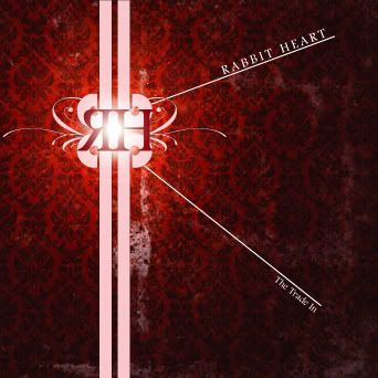
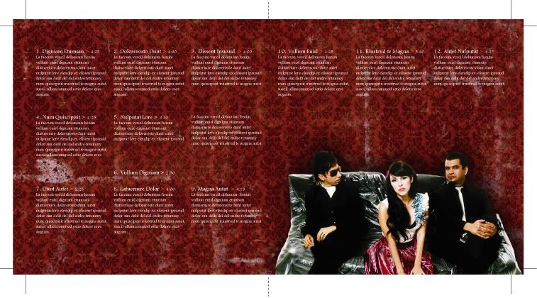
Logo Design & CD Cover for the band called Rabbit Heart


I really had lots of fun creating the Rabbit Heart logo for this indie, electronica, mellow band. Ofcourse the three people on the couch are the members fo the band Belanova and not Rabbit Heart. [I didn't have images of the members from the band.]
0 comments
Getting a Facelift: Identity Rebranding Part II

Class assignment:
Give an existing company a new identity. Rebrand their image.

Client: Lyceum Books, Inc.

Lyceum is an independent book publishing company that focuses on publishing Social Work related books for teachers, students and people interested in social work.


Original Logo:


My Vision for Lyceum Books, Inc:


Lyceum's work towards spreading the knowledge of social work portrayed a sense of knowledge that once obtained, would enlighten the reader and in turn they would have the tools to grow and help reshape this society and the community in which they live in for the better. Thus, the logo that resembles young plant sprouting as growing, and also an abstract person growing and aspiring to grow upwards. I hope that made sense.


0 comments
Getting a Facelift: Identity Rebranding

When I read the mission statement for Hotel Metropolis, something that caught my eye is their emphasis in the words "vivid colors." Yet I felt that their existing logo lacked color! I wanted to make it modern, elegant and colorful and at the sametime not making a rainbow out of it.

Original Logo:


My vision for their new logo: